
Graphic design and brand identity naturally evolve, but the Ferris design community share distaste for today’s trends.
“Design plays a role in every aspect of everything we do,” Professor Alison Popp Meier said. “Design is everywhere. It’s a critical aspect to how we live our lives and how we work.”
In Popp Meier’s introduction to design class, she assigns her students a project called design emergency. Her students get to pick an issue of design present in any brand and come up with a solution
Popp Meier says that design consults problems, which is why she loves giving students this project. She wants to connect students with solutions and make them think of situations they’ve been in that could’ve been solved by tweaking designs.
When it comes to change, Popp Meier is on board. She’s an early adapter to updates and new ideas of design, except when they’ve been poorly executed.
“When a brand changes and it doesn’t connect with most audiences and doesn’t make sense, usually the problem is [the] design was treated like a veneer and it wasn’t a strategic force for the solution,” Popp Meier said.
Some brands do follow trends and sometimes change doesn’t always work out. Popp Meier said that after a rebrand, sometimes things don’t get better, which shows her that that brand didn’t have design a part of their core strategy and didn’t invest enough into the design process.
“When they didn’t bring high-minded or experienced designers into the mix early enough in the process, or they disregard good design advice, that’s when you see the disasters in the rebrand,” Popp Meier said. “Good brands don’t just react, they lead, and leading with a good brand takes a lot of expertise.”
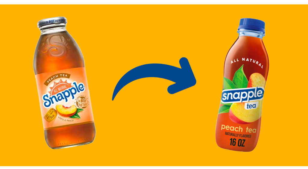
Snapple came to mind when the topic of poorly executed rebranding came up. The brand has evolved every few years, and the new update has introduced a plastic bottle with a regular twist-off cap.
Popp Meier said that Snapple is an example of where she doesn’t know what their thinking was. She questions the research done in this rebranding; because, to her, any little bit of audience research would have told them that their classic metal cap and glass bottle were key brand attributes.
“They had a thing, and they [lost] their thing by changing that typography and bottle design. They lost their unique brand positioning by doing that,” Popp Meier said, “It’s not clear that they were targeting any one particular group, and they were trying to be all things [and] all people, that’s a detriment to a brand. You have to have a unique value proposition for a particular audience.”
She started working at Ferris mainly because of the uniqueness of the College of Business and the design teaching approach that is offered. She said that there are people here like her that are dedicated to the idea that everyone could be successful if they work hard.
“Ferris is an amazing place. It really has all the elements of an excellent brand ,and there’s a real opportunity to make the branding connect with students and the community in a meaningful way with a lot of strategy and creativity,” Popp Meier said. “[This] generation was really looking for all the stuff that Ferris has. Ferris branding has a lot of potential to connect with audiences and resonate more than ever.”
Graphic design junior Katie Shantz spoke on always being taught to embrace the use of white space and simplifying design. She believes that at some point, especially when it comes to package design, this mindset can make it hard to distinguish and differentiate between brands.
“Snatching away all the spice in the character is making these brands that we all know and love so much less distinguishable, just because everything looks the same,” Shantz said.
According to Shantz, this can make it harder for consumers to make a decision on which brand to buy or distinguish what is in line with what they really want. The design similarities make it hard to tell what every brand stands for and who they even are. Switching to this minimalist design isn’t a good representation of what certain brands stand for.
Shantz used Chobani’s brand as an example of why not all brands should take the minimalistic approach. She believes Chobani has warmth and character behind it, differing from other food branding because it isn’t typical food photography or corporate illustration.
“I personally buy products, and virtually everything, based on how it looks,” Shantz said. “Even when it comes to cleaning supplies, I pick that out by the packaging, and if everything looks exactly the same, I’m going to pick the one that has a little bit more spice to it.”
Brands are more likely to take the minimalist approach because it’s trendy and easier. There isn’t much work needed to make a logo appear minimalistic and clean.
As long as the logo is able to be translated just as effectively to other media. It needs to stand together like a “branded experience” and be concise for it to work as a simple, yet effective logo.
Shantz thinks that some of the certain typefaces Ferris uses in their branding only works sometimes because they lack warmth and voice. A brand doesn’t need to create a busy logo in order for it to be effective.
“Something that Ferris takes pride in really is just all of the different facilities and organizations they have to offer, as well as the diversity among students and different experiences. I do not feel like their logo is super representative of that,” Shantz said.
Marketing junior Evan Nowak thinks that the trend of a more modern design is based on demographics and a “cultural switch.” Companies are changing their design so that they can reach a new audience as they make their products look more stylish and appealing. He believes that the new modern designs makes consumers feel new and fancy, but he enjoys diversity within his products.
“I feel like [color is] an eye-catcher, and a lot of companies are sacrificing that just to look modern, but bright colors can get a customer’s attention too,” Nowak said.
This change in design is a trend. Brands are all racing to achieve a new look for their own company. Nowak said if everybody tries to race to be different, everyone is going to end up looking the same.
The design that this generation grew up on was once new. There’s another change because when people get used to one thing, it loses the interesting edge it had before. A lot of people like change because things get old, and they crave something new.
“For our generation, the products that we loved were the previous generations change. If you keep something around too long, it loses a customer’s attention, [and] it’s bound to change,” Nowak said.