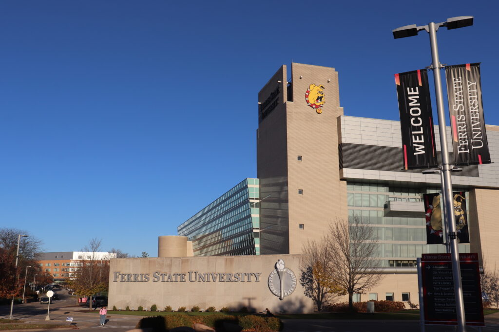
The exorbitant price of the new signs on the FLITE Library has come to light and it’s important Ferris students talk about it. I believe these signs are redundant and against the student body’s actual interests.
The new signage is part of a wayfinding project with a hefty budget of 1.5 million dollars to make it easier for students to navigate campus. The project includes improvements in vehicle navigation signage, parking lot identification systems, larger building identification signs and street signage, according to the Ferris State Board of Trustees meeting minutes from Feb. 18, 2022.

However, I see no way these new signs on FLITE help students navigate any better than before. The westernmost corner of the FLITE building, where the signs are located, already stands taller than any of the surrounding buildings. The signs face at an angle away from the majority of the campus, so I see little evidence that they are for the benefit of those traversing campus grounds.
The signs are also placed directly above an existing sign with the university’s seal, which I believe better represents Ferris as an academic institution.
Adding the new signs in this location is a redundant defacement of the FLITE building which should be a symbol of higher learning.
This leads me to think that those in charge of this project don’t have current students in mind, but rather prospective students and visitors. The university’s most recent master plan states that the goals are to “improve branding” at places such as entry points and the edges of campus.
This alludes that their goal of increasing enrollment not by improving the university for the student body, but instead by focusing on making the university more attractive.
“The giant Brutus will be illuminated at night, serving as a beacon of inspiration and joy,” was the explanation used in almost every caption across multiple of Ferris’ social media posts regarding the sign. The sign will likely have a different effect.
Who is it supposed to serve as a beacon to when the majority of residence halls, classrooms and therefore students sit behind it? I believe that the sign will serve as a reminder that the school cares less about its student body than it does about enrollment numbers and boasting its image.
In my opinion, this is a stark reminder of the ways the higher education system in the United States is flawed.
The high demands for degrees have driven schools to focus less on the quality of their programs and education. Schools are willing to spend 1.5 million dollars on signs when there are much more pressing issues on campus.
It seems as though today schools find more of their identity aligned with sports, status, and branding. Schools have become a product, and products need advertising. I don’t blame Ferris for the cultural and economic systems that are already in place, however, I wish they had chosen to do better.
